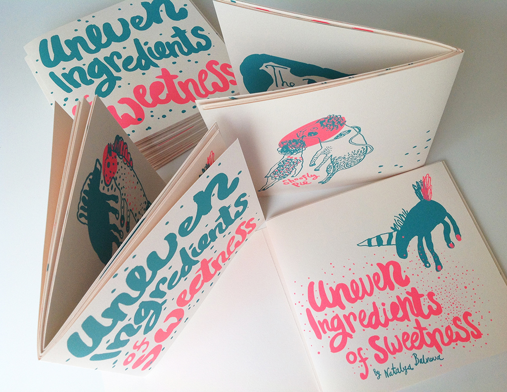
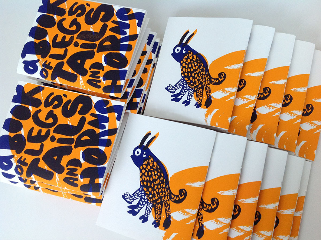
I came across the work of
Natalya Balnova whilst researching for our group screen printing project, and immediately fell in love with her style. I think her choice of colours and regard for white space really lift her work off the page and help bring it to life, as the colours are both very flat and solid, yet weave between each other effortlessly. I also really like how simple the actual construction of the books are, as they are often secured with just a simple pamphlet stitch, which I think really echoes the feel she is trying to get across of simple yet precise.
No comments:
Post a Comment